Opening
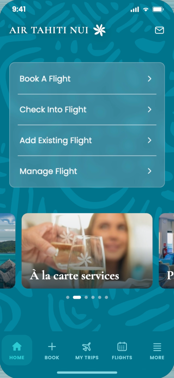
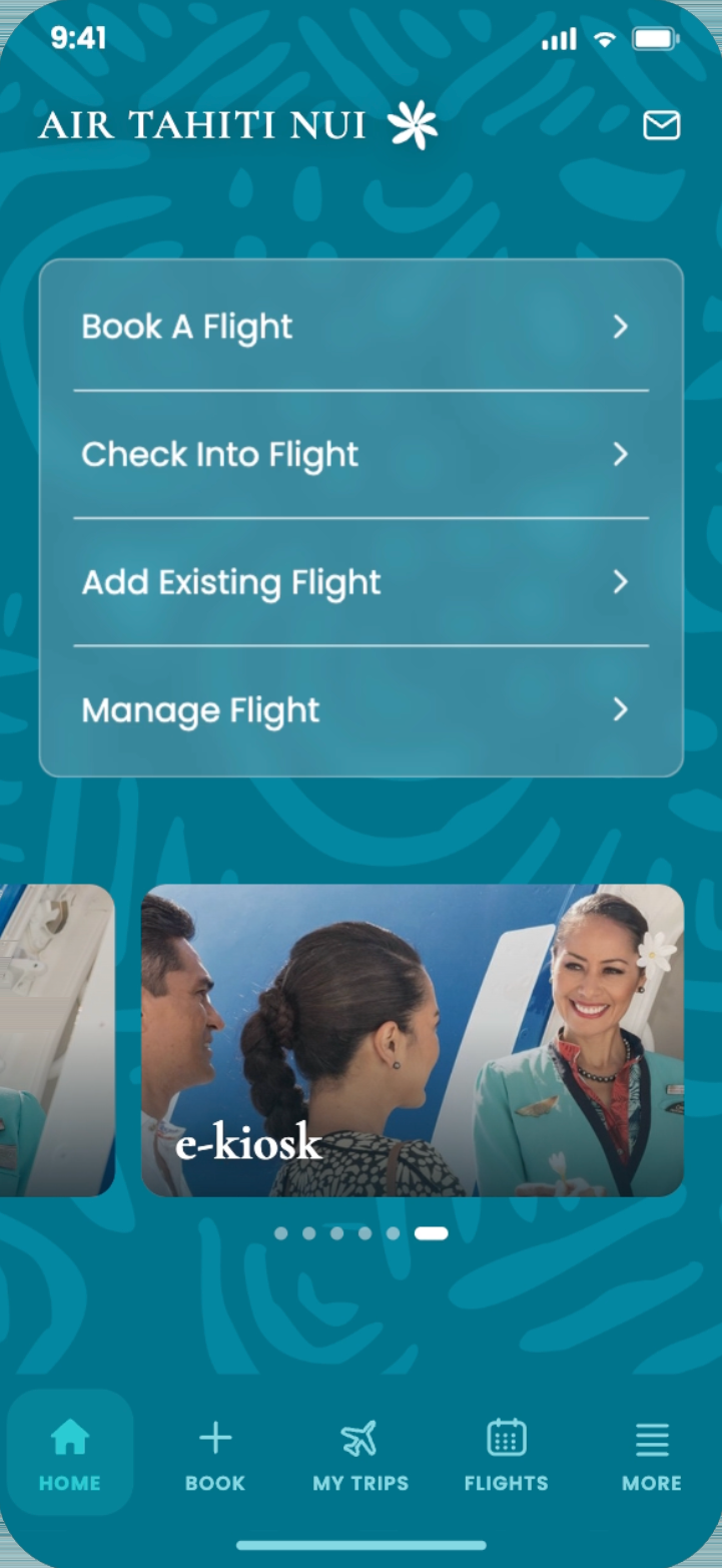
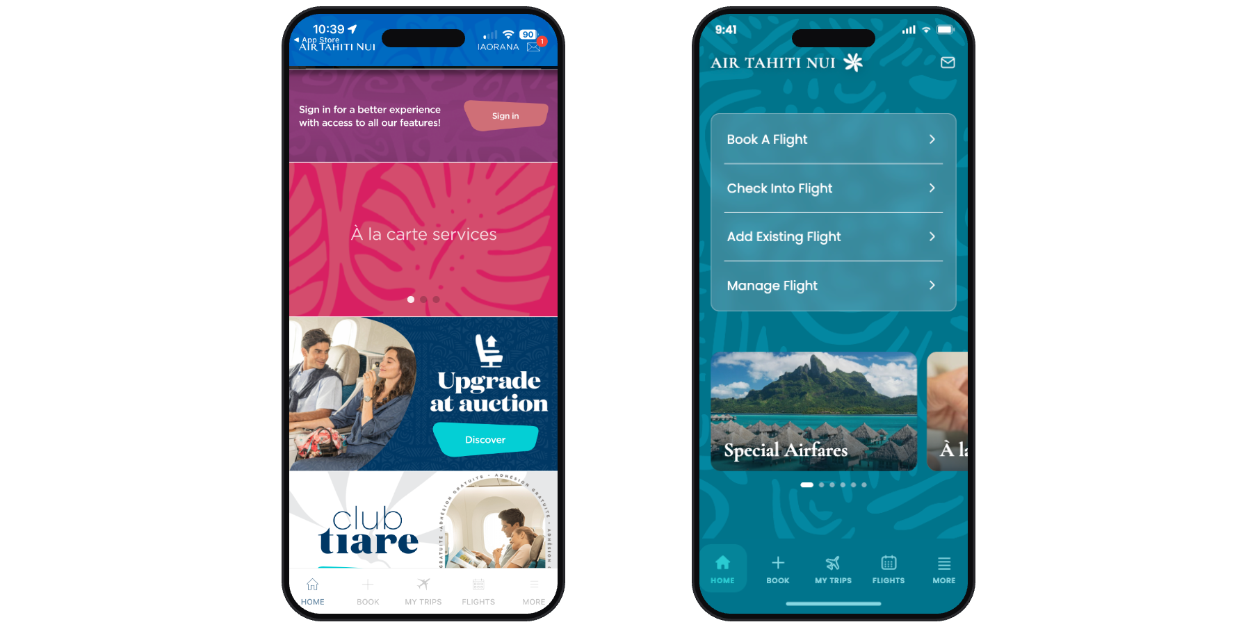
No clear call to action became one focused image and an obvious way in.

A self-initiated redesign of the Air Tahiti Nui app. Six screens, an original pattern drawn from the airline's own motifs, and a full icon set, built in Figma and Illustrator.
Air Tahiti Nui is the national airline of French Polynesia — one of the best-rated airlines in the world, with a brand built on the imagery, patterns, and color of the islands it flies to.
I had a flight booked through this app. I opened it to find my flight information and immediately felt overwhelmed — competing images, funky shaped boxes, colors fighting each other. I couldn't figure out where to tap.
So I closed it and looked up my flight information in my email instead. That's when I decided to redesign it.
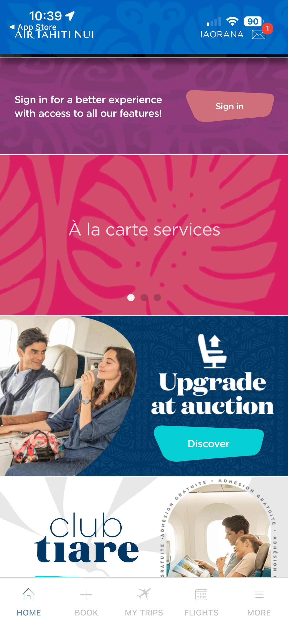
Every screen kept its job and lost its noise — each original, beside its redesign.
No clear call to action became one focused image and an obvious way in.
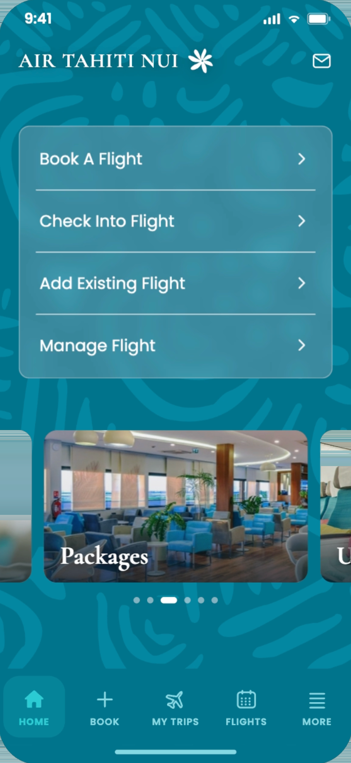
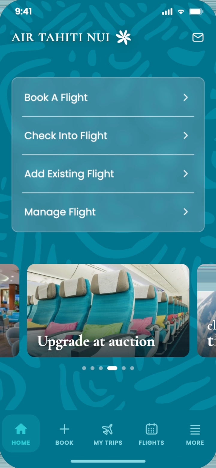
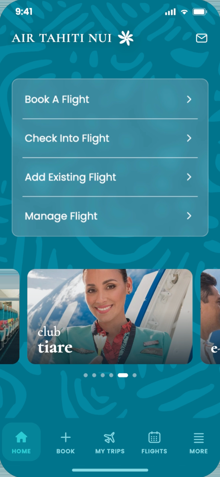
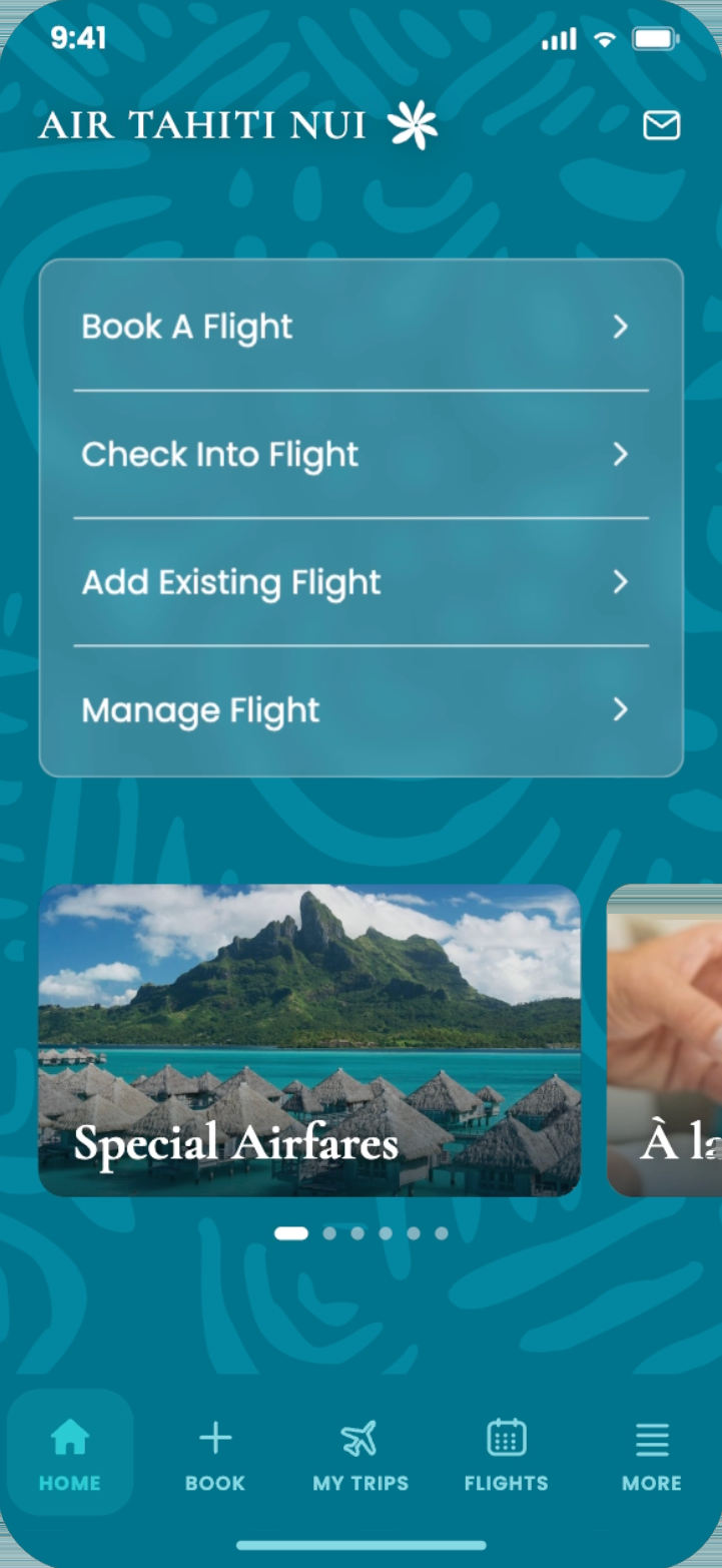
The scattered promo banners became one rotating carousel, so the same offers get a clear, single lane instead of competing with everything else on the page — plus direct access from a single place, on an original pattern drawn from the brand's motifs, and a taller nav bar that's easier to tap.
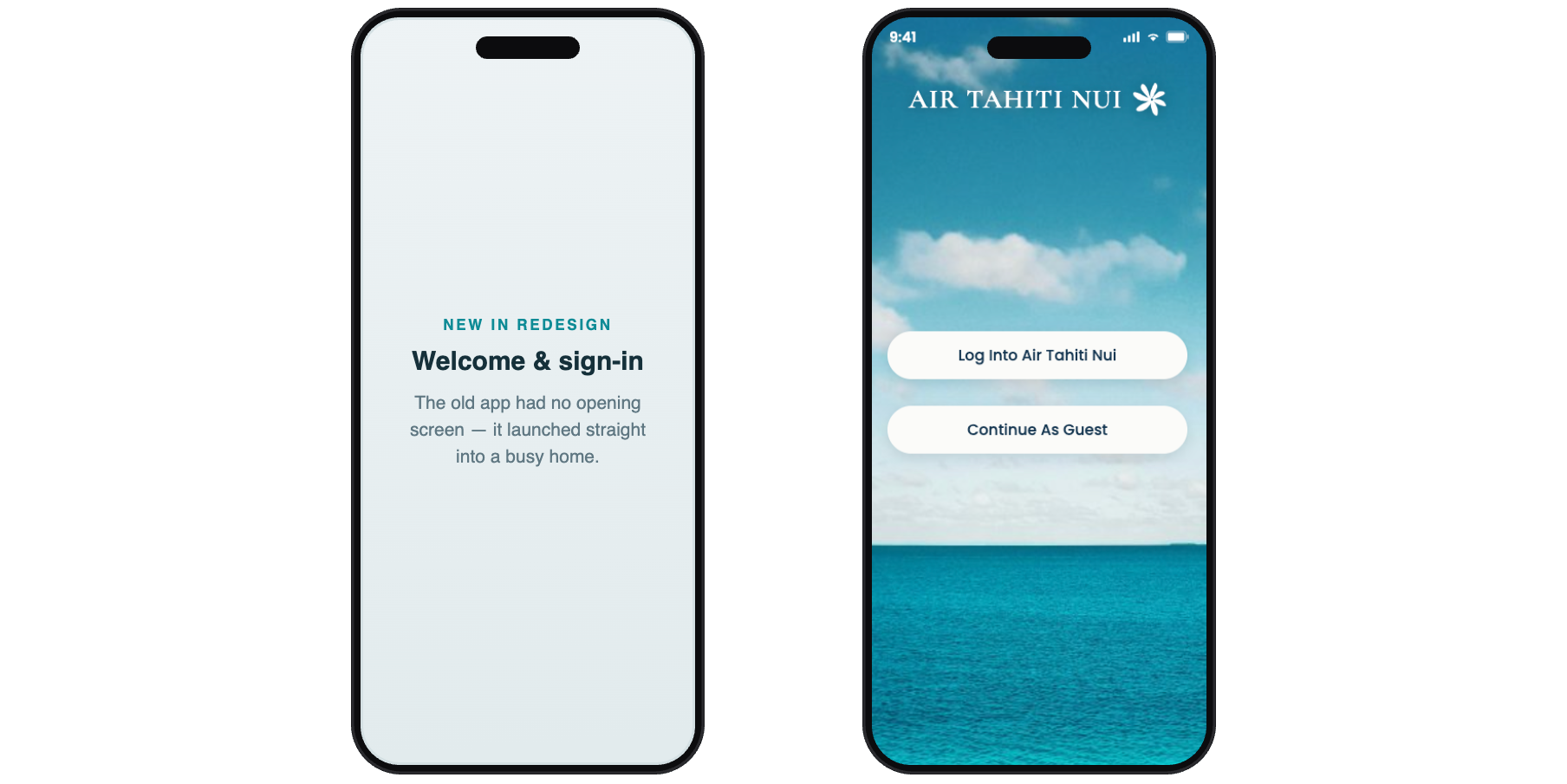
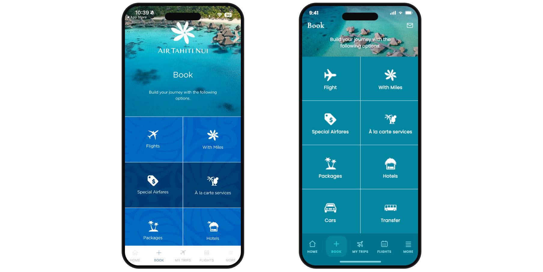
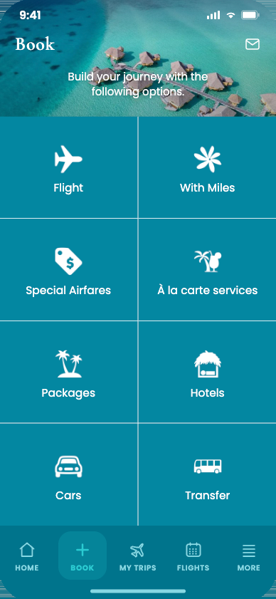
The photo you had to scroll past is gone — it opens directly to booking, with redrawn icons.
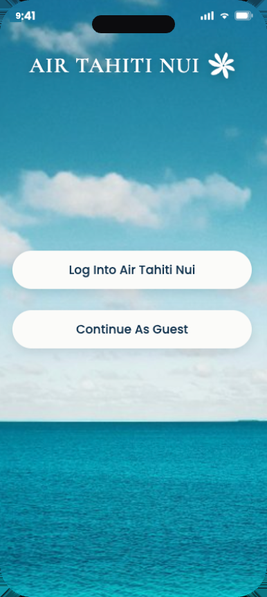
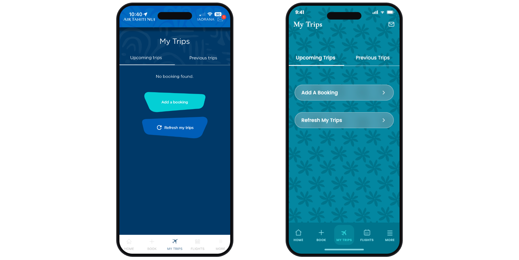
A new background built from the Tiare gardenia; buttons simplified and enlarged for easier tapping.
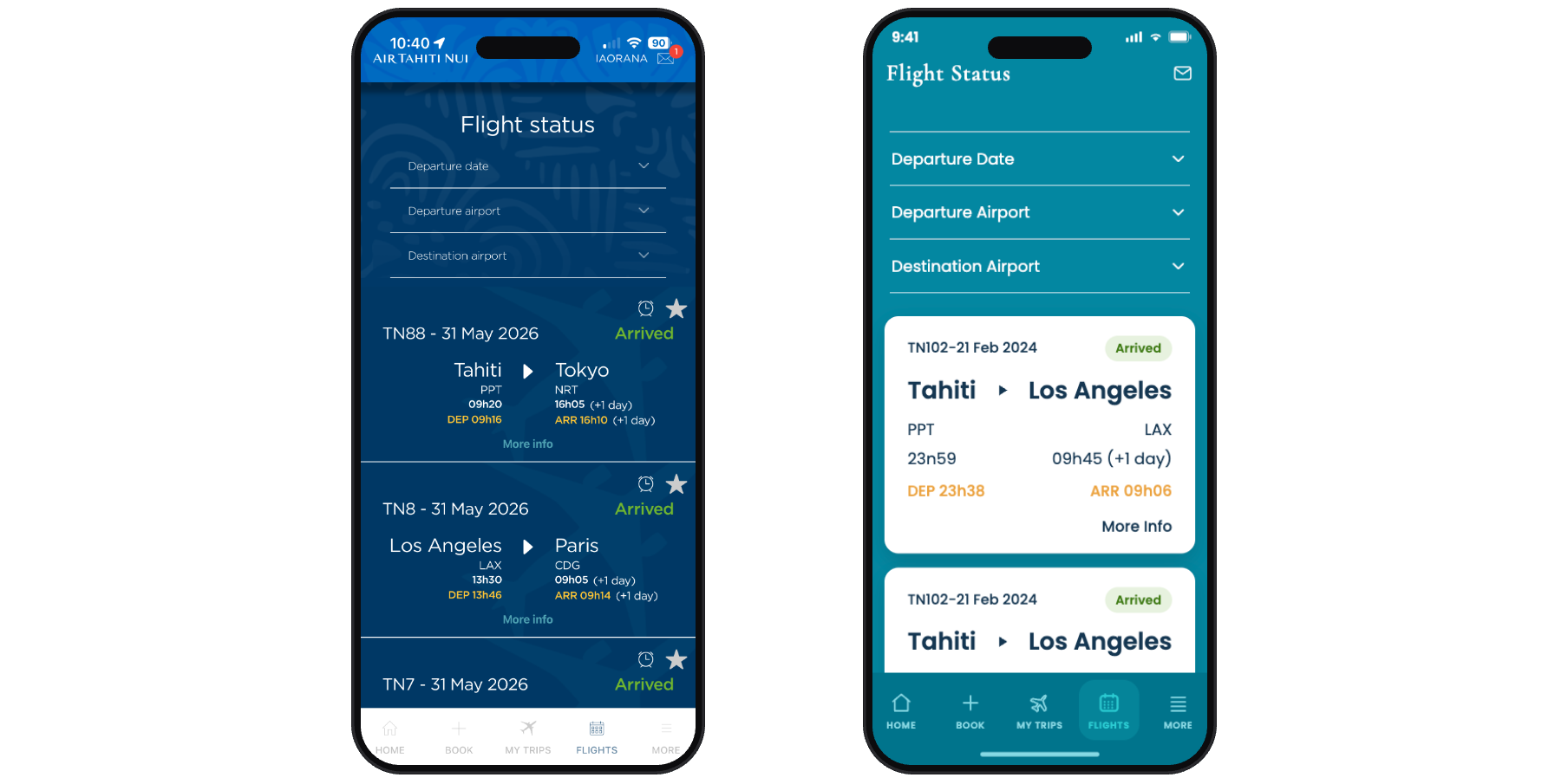
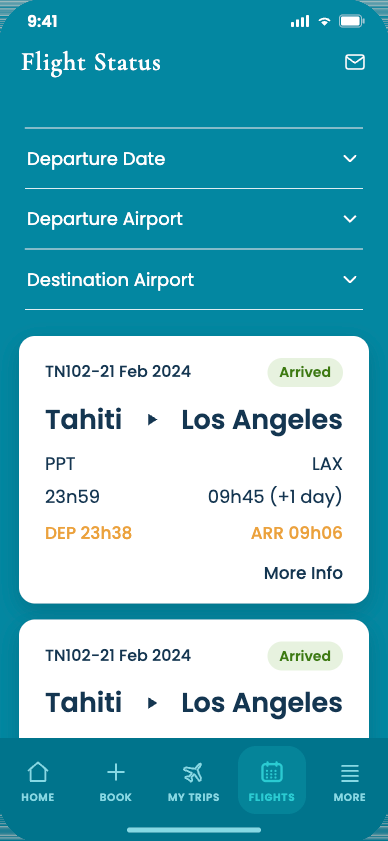
Competing patterns stripped for clean white — this screen carries the most information.
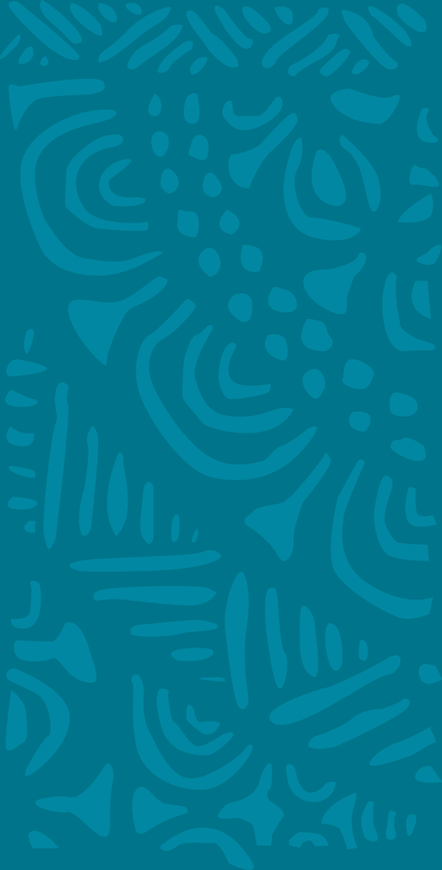
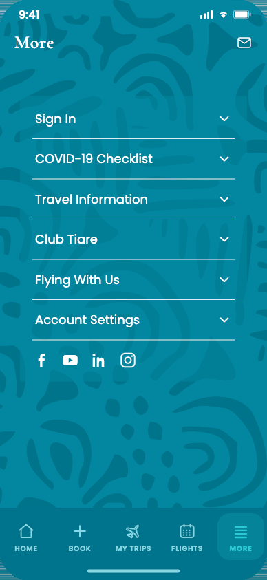
The pattern returns, colors reversed and flipped vertically — consistent without repeating.
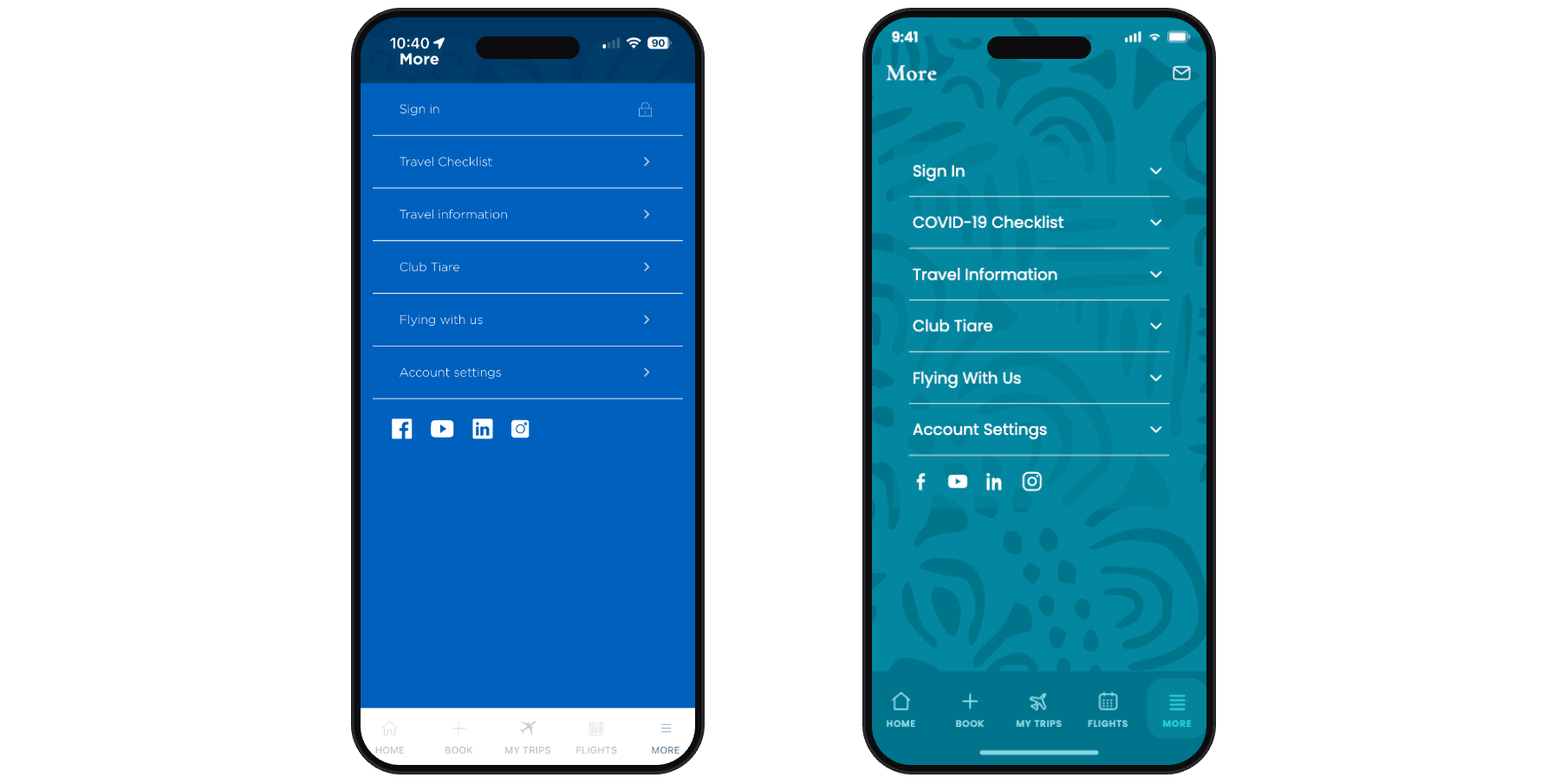
A self-initiated concept project focused on the screens users hit first. I owned:
I made one decision up front: don't reinvent the brand, dial it in. Everything I worked with already belonged to the airline — the photography is pulled directly from their own website, the Tiare gardenia from their logo, the motifs from their site, the colors from their physical materials. My job was to take a brand that was already gorgeous and tune it so it actually supported the function of the app.
The Tahitian Gardenia from the wordmark became the seed for the Trips screen background.
Working from motifs already on their site, I drew an original pattern that feels true to the brand, not decorative.
One confident teal, the color of the water they fly you to, replacing a clash of blue, purple, and pink.
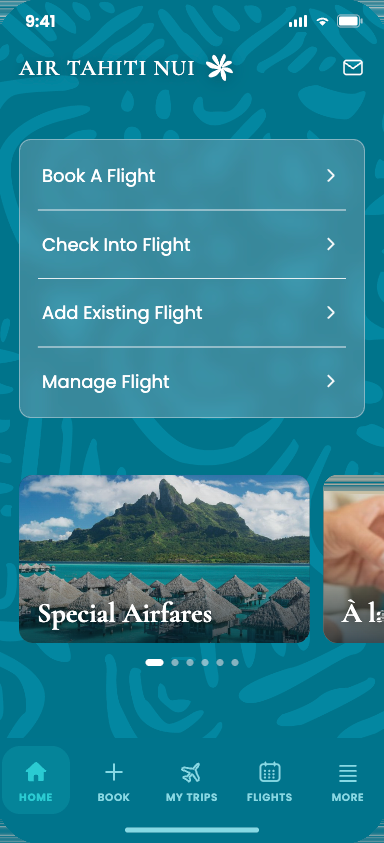
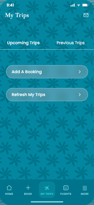
None of this is invented — it's the airline's own brand. I wanted the app to feel like the destination — calm, premium, unmistakably Air Tahiti Nui. One lagoon teal carries the system, grounded by ink navy and shell white, with a sunset coral drawn straight from their own destination photography.








The cluttered original, rebuilt into one calm, navigable system. Every photograph here is Air Tahiti Nui's own, pulled directly from their website — re-laid into a clearer layout.
A confusing app doesn't just frustrate people — it costs the airline. Every clunky screen chips away at a premium promise the brand spent decades building everywhere else.
One clear call to action, one focused photo — people know where to go instead of bailing before they even start.
Cut the photo blocking the booking screen, and the most important button sits one tap closer. Shorter paths book more flights.
Consistent brand presence across every screen, from wordmark to icon set.
I'm not Tahitian, so I approached the culture with care and respect rather than invention — every visual choice was pulled from the airline's own materials, never assumed. Air Tahiti Nui's brand was already beautiful. What mattered most to me was that the design guided you through the app, so people didn't get lost in the design.